
“Typography is the use of art to advocate, communicate, celebrate, educate, elaborate, illuminate and disseminate. Along the way, the words and pages become art.” – James Felici, The Complete Manual of Typography
by Giorgia Pizzato
In the era of algorithms, social media and digital printers it is easy to forget, how for long time the written word was a luxury accessible to few. Monopolized by clergy and scientists, knowledge could only spread through the patient work of scribes.
It was a small German goldsmith, Johannes Gutenberg, who revolutionized the world of knowledge by freeing the written word thanks to the use of the first movable type. A very break-through product that owes its first major success to the publication of the 42-line Bible (Frankfurt, 1455).

Movable type printing
Gutenberg had three great intuitions : the choice of the metal alloy to create more resistant types; the printing press, whose invention was inspired by the grape press; the use of oil-based inks, more durable than the water-based ones.
If typography originates from the technical necessity of reproducing written texts in series, throughout history and above all in today’s society typography rises to a rare and priceless art form.
Typography: from practice to artistic technique!
Typography is the art of freely composing words with the use of movable embossed types. The typographer modulates the words through the choice of the font, the dimensions and the layout, charging them with meaning and emotions, transforming the text from a mere reading element to a work to be lived.

The type is the fundamental element, it acts as a stamp. One must start from the design of the letter and engrave it specularly on a steel block, the punch. The punch is struck on copper to create the matrix into which to pour a lead, tin and antimony alloy and hence obtain the various movable types..
At this point the text can be composed by juxtaposing the types one by one on the composing stick until the completion of the lines of text and therefore of the pages. The draft is corrected and any typos eliminated. The page is inked and transferred to the paper by pressing it. The process is completed with the packaging of the printed support, which can take the form of a book, newspaper, card and much more. The first books so printed are defined incunabula, which have the appearance of manuscripts, especially for the presence of the drop caps, the division of the writings into columns and the absence of the title page.
Letterpress printing through History

Movable type printing became widespread in European countries, with particular success in Northern Italy: the Venice of the sixteenth century appeared as the main European center of the book, in 1472 the Divine Comedy was the first book printed in Italian. Starting from the seventeenth century, the distribution of the first newspapers in Europe also began.
The realization of each volume required great skill and physical effort, the number of copies made was therefore scarce. The rise and development of the publishing market pushed towards technological progress resulting in the invention of mechanized printing methods for large print runs. A new paradigm took hold in this context: that of rotary printing.
At the beginning of the nineteenth century Friedrich Koenig created a steam-powered cylinder flatbed press for the London Times. In 1943 Richard March Hoe introduced the rotary machine composed of vertical cylinders: the continuous movement exponentially increased the number of copies produced every hour, also thanks to the coil feeding, that is with a continuous sheet, by William Bullock. A decisive evolution of the press finally came with Ottmar Mergenthaler who launched the Linotype machine: typographs no longer had to compose by hand every single word but used a keyboard – just like that of our computers – which directly released the types in the composite.
Lithography & offset printing democratize images..

In the world of printing, the other great pillar is represented by lithography, a printing technique based on the phenomenon of repulsion between water and ink, widely used for the reproduction of images. Introduced by Alois Senefelder, lithography uses a calcareous stone matrix on which to specularly draw with a fat pencil. The components in pencil retain the ink while the bare and wet parts of the stone repel it, so that once pressed the matrix will only transfer the first ones. Today’s offset printing is based on the same principle, it uses hydrophilic copper letterpress plates whose graphic elements are treated to accept the ink.
Chalcographic printing
If typography is an embossed print, its opposite and complement is the chalcographic engraved print, in which the work is engraved on a copper or zinc plate using a steel “tip”. The matrix is sprinkled with ink and cleaned, so that only the incised parts contain the liquid, and finally pressed with the chalcographic press.
Graphics and typography: two sides of the same coin
Parallel to the establishment of printing techniques, a strong interest developed around the graphic aspect of the texts that resulted in a flourishing matrix market.
Mathematicians and artists began to study and design the drawing of letters, proportions and distances by creating new and different fonts, that is a complete set of characters of the same type, distinguished by graphic and body style.
The artistic production of fonts has represented and still represents a fundamental component for all that concerns the world of communication.
Typography as a synonym for dialogue: in fact, all typographic styles are designed to convey a specific message; just as the tone of our voice in pronouncing a sentence gives it a certain meaning, in the same way the look of the font determines a visual inflation. A type can be…
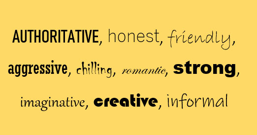
… it can take on thousands of different and mutually opposite nuances: the graphic of the type is never banal, it is not the result of a superficial choice, it has instead the ability to persuade and evoke, to help us make choices, consciously or unconsciously.
That of typography is an art and a profession that it is important to cultivate and transmit as it allows the encounter between traditional craftsmanship and modern creativity and blends the dimension of manual work with that of emotions. An art, as Winckelmann would say, of noble simplicity and quiet grandeur.
THE MASTERS ON MAD’IN EUROPE

Giovanni Ottaviani (Tipografia Grifani-Donati, Italy), who defines his typography as “home and workshop”, is a printer, lithographer and calcographer who represents the seventh generation of printers and carries on the activity and family tradition, begun in 1799. In his laboratory, every stage of production is manual, from paper cutting to printing, for which he uses the milestones of the typografic tradition: a lithographic press ‘Bollito&Torchio’ from 1840, a printing press ‘Elia dell’Orto’ from 1864, a platinum 35×50 Victoria Original Tiegeldruk of 1903, a Paolini chalcographic press from the 1960s, a 1910 Werkaugsburg flat-bed cylinder printing press. Giovanni loves to share and transmit the history and technique that are soaked in the walls of his workshop, for this reason he offers a series of guided tours in its ancient Typography.

For Elisa Tallone (Alberto Tallone Editore, Italy) professional printer and book binder, the main goal is to offer her customers the best possible reading experience. In Tallone publishing the Beauty, Harmony and Readability of the editorial tradition survive and are transmitted with great skill thanks to an almost centenary know-how and an impressive collection of original typefaces from the 17th to the 20th century. The finest materials are used in the laboratory, such as pure cotton paper, Japanese and Chinese vegetable fiber paper, antique artisanal paper and of course … ink!

Also the graphic designer Nicolas Ragamey (Atelier Typo e la Cité, Switzerland) has not been able to resist the art of typography and since 2005 he has devoted himself entirely to it in his Atelier. Here he combines the most traditional typographical composition techniques with the most recent ones, including hot stamping (through pressure and heat, a metallized or pigmented film is transferred onto the sheet), relief printing (impression of colorless images on a sheet by pressing it between the dies), the thermographic printing (consisting in sprinkling printed motifs that are still damp with thermoplastic powder that melts and creates a transparent, metallic or fluorescent relief surface).


Raymond Meyer (Atelier de gravure Raymond Meyer, Switzerland) is an expert chalcographer, who has been engaged for over forty years in the cultivation and transmission of the chalcography and other printing techniques. The Master opened a first atelier in 1973 and in 2004, given the great demand from young artisans, he decided to open a second one. Since then over 180 artists have crossed the doorstep of Pully’s and Lutry’s laboratories, and with each of them, according to Meyer, the work takes a different turn and it is a pleasure for him to adapt to their nature and to put himself at the service of their imagination and creativity.

TALLONE EDITORE 
TIPOGRFIA GRIFANI 
CALCOGRAFINA – TIPOGRAFIA GRIFANI


